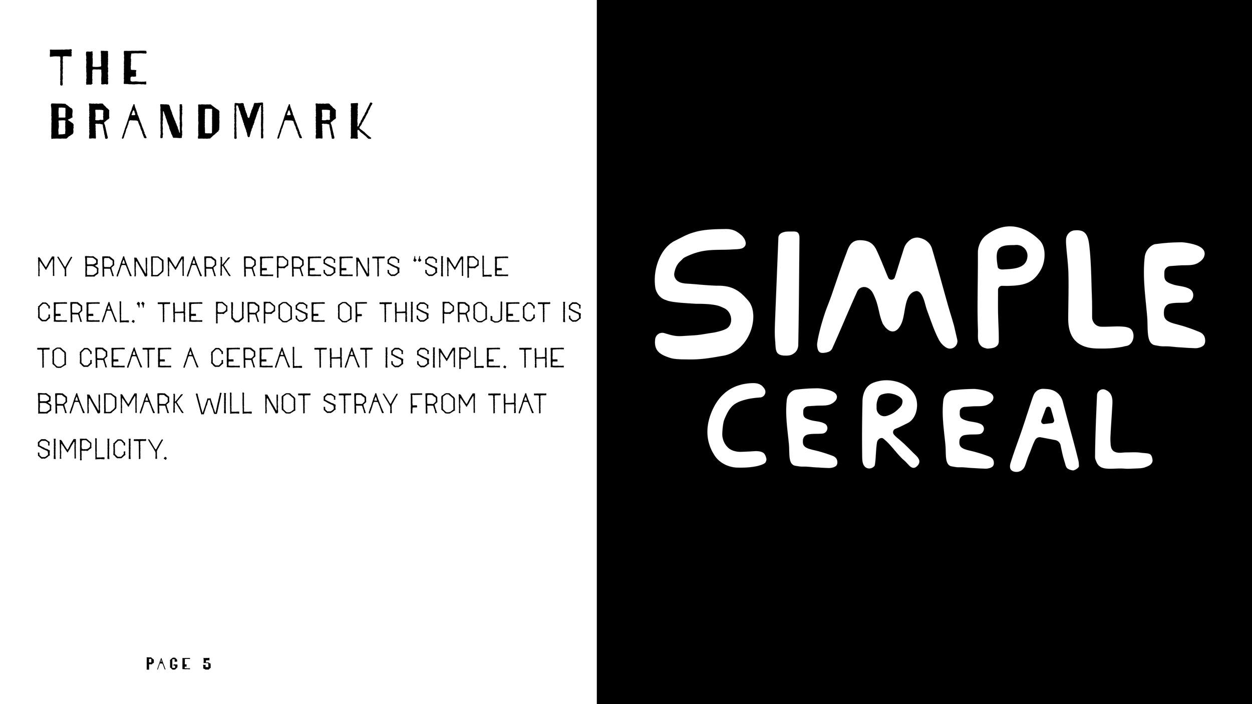
Simply Cereal

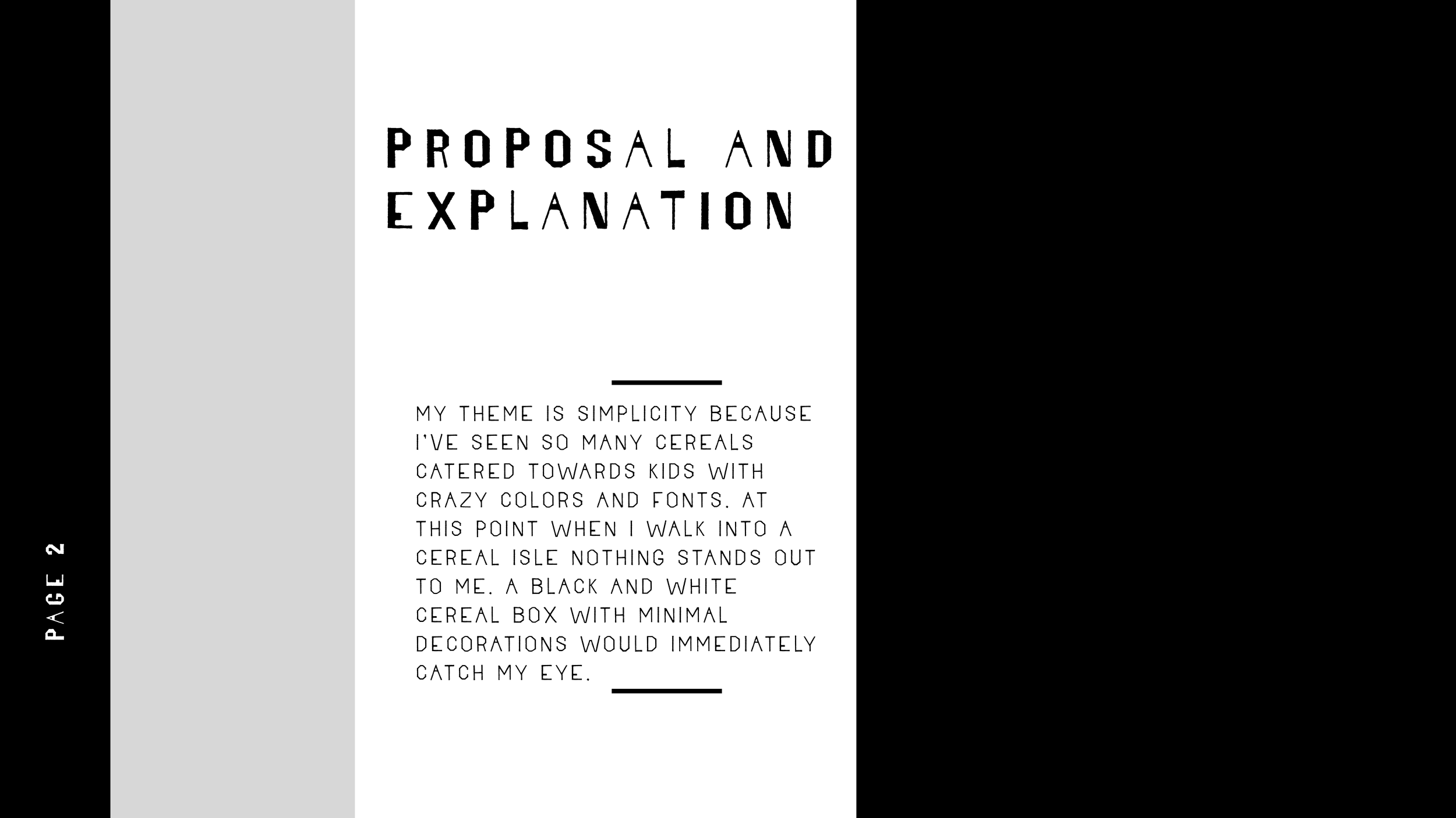
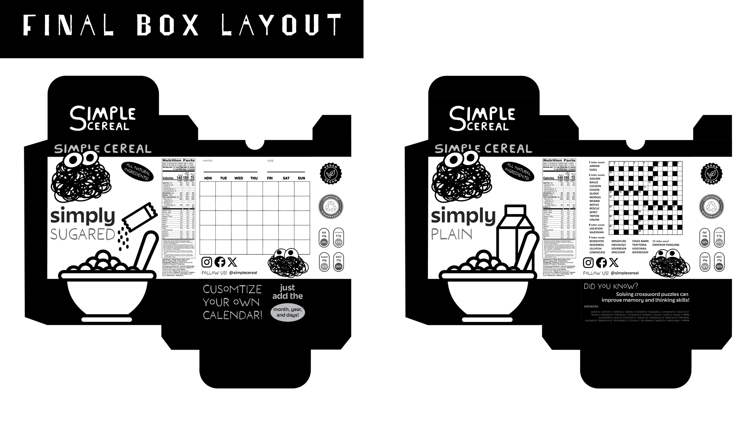
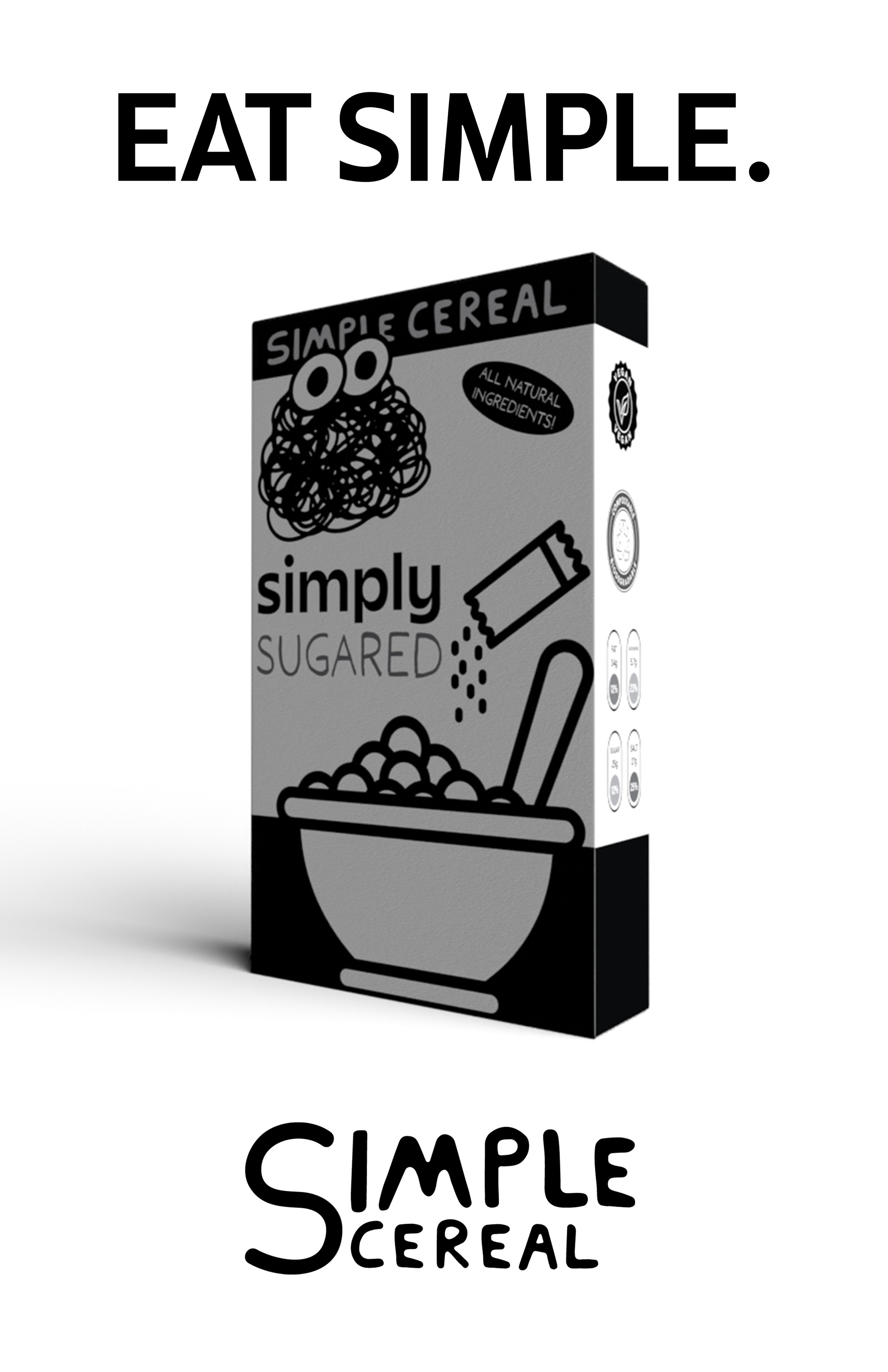
The theme of simplicity stems from my observation of the overwhelming visual clutter in the cereal aisle. Many cereals are marketed toward children with vibrant colors, busy fonts, and excessive graphics. As a result, it can be challenging for any single product to stand out. Personally, a minimalistic black-and-white cereal box with subtle decorations would immediately catch my attention.
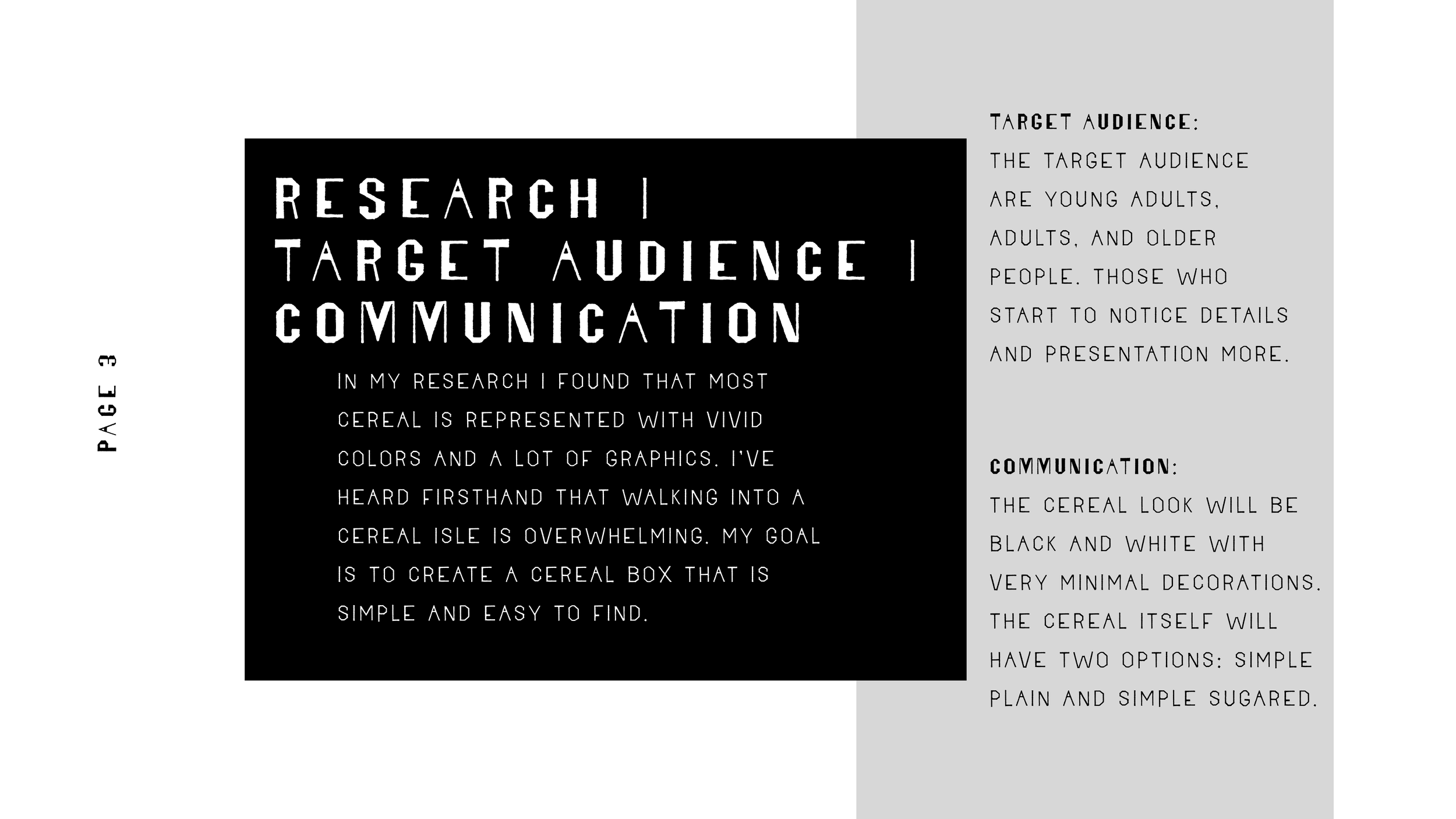
Through my research, I discovered that most cereal packaging relies heavily on vivid colors and dynamic designs. Feedback from others confirms that the sheer variety and intensity in the cereal aisle can feel overwhelming. My goal is to create a cereal box that embraces simplicity—something easily recognizable, calming, and distinct among the noise.
process book